
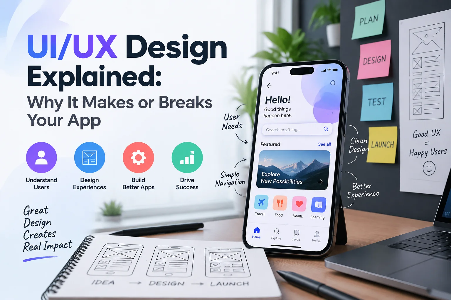
UI/UX Design Explained: Why It Makes or Breaks Your App
You might create an application that has great functionality, rapid technology and a smart business concept in it, yet none of that can be assured to make people like using it.
Consider downloading a new app because it has the ability to solve an issue you have to deal with on a daily basis. You open it and are at once confronted by a perplexing screen. The buttons are not user-friendly, the key features recline, the registration process seems to be longer than necessary and you do not know what to do next.
What time would you allow it?
Probably not much.
Suppose there is another app that provides the same service. It loads fast, tells you what you must know, ushers you through the initial steps, and important actions are readily located. The interface is not something you need to consider since the interface works the way it should.
It is that difference where UI and UX design comes in.
Good app design is not merely one that makes the screens look beautiful. It is all about making an experience that makes people learn the product, do less work to do it, have confidence in the business behind it and have something to come back to.
UI/UX design is thus not a cosmetic phase to be implemented following the development phase of businesses that invest in mobile or web application. It has the power to determine the success of the product.
UI and UX Are Connected, but They Are Not the Same Thing
UI and UX are commonly used interchangeably, and this can be confusing at times since it can appear as one name.
They are very much related, and there is a productive difference.
UI is an abbreviation of User Interface. It includes the elements of an app that individuals view and engage with. It comprises buttons, typography, colours, icons, forms, menus, spacing, cards, and elements of navigation as well as a visual presentation of every screen.
The abbreviation of User Experience is UX. It is broader. UX takes into account the experience of using the product both initially and the final stages. Do users know how to do? Are they able to accomplish a significant task without getting lost? Does it make sense? Do they have unnecessary steps in the way? So what happens in case of something going wrong?
Consider a food-delivery application.
The UI comprises the appearance of the restaurants, the appearance of the buttons, the way menu items are listed and the appearance of the checkout screen.
The UX covers being able to easily locate the type of food you want, modify an order, comprehend delivery fees, type in an address, pay, follow up on the delivery, and recover in case of an error.
A beautiful UI and poor UX may be encountered in an app.
It might appear great in screenshots but once somebody starts using it, it may be frustrating.
The reverse can occur as well. A technological application might appear convenient, yet it can have unmatched appearance or look amateurish and make the product look less trustworthy.
Both are required with strong digital products.
Your App Is Being Judged Before Users Explore Its Best Features
Features are natural business things to be excited about.
Real-time analytics, we have.
Our application is automated.
Everything can be managed by the customers using a single dashboard.
We have incorporated five services.
Those capabilities can be useful, however, a new user cannot get an immediate idea of what is going on behind the screen.
The interface is first felt by them.
During the introductory scenes, they start creating impression. Does the application appear to be reliable? Is it a modern feel? Is the action next apparent? Does the product appear to be hard to use?
This is the reason why first impressions are important in app design.
It is not about stuffing all the features you have created in the first screen. Actually, it can be worse to do so.
What would be more helpful is to get to know what is important to a person who is coming to that point.
The recent Human Interface Guidelines of Apple put an emphasis on purpose and simplicity, prompting designers to establish what holds the greatest importance to users and eliminate unnecessary interfaces to keep their interfaces straight and simple.
The first thing that you see should thus respond to a basic question:
What does this user need right now?
Not what is capable of being shown them by the app.
Good UX Makes Complicated Technology Feel Simple
Certainly some of the most helpful apps are doing intricate work behind the scenes.
Banking applications are linked with financial systems.
The apps used in traveling handle vast amounts of availability and prices.
Business platforms can be a combination of reporting, customer data, workflows, permissions, and communication tools.
All of that complexity does not have to be comprehended by customers.
They must get their job done.
This is among the most precious of things good UX can do: it can make complicated technology seem approachable.
Assume that you are developing a business finance application.
Data points may number in thousands in the system, yet the average user is unlikely to have a need to see all of them on the home screen.
They may just wish to know:
What was the amount of money received?
What needs attention?
Which are the overdue invoices?
So what am I to do?
Good UX determines what is worth paying attention to and what can be kept on-hand when required.
Apple design guidelines also suggest that vital information should be readily accessible and employ the hierarchy to ensure that individuals know what content and controls are important.
Simple does not imply the lack of helpful functionality.
It is the process of structuring complexity in such a way that it is not carried by the users.
Navigation Should Not Feel Like a Puzzle
When a user constantly believes that he/she cannot find something, then the navigation should be changed.
One of the design elements which seems to go unnoticed when done well is the navigation. Individuals flow through parts of the application unconsciously without consideration of the design.
When it does poorly they can see that.
There is a lack of clear labels in menus.
The back button does not work as expected.
Significant moves lie several screens in.
The app has different patterns of navigation in various sections.
Users keep on returning to the home screen as they do not know where they are.
These may be minor interface problems in the mind of a business. They determine the experience to the user.
Consistency is important as individuals get to know the patterns as they use an app. When a button acts in a certain manner they will demand other similar buttons to act in the same manner.
The principles of design applied by Apple particularly encourage one to consider familiar concepts and maintain visual and interaction patterns since familiarity will enable individuals to learn an interface faster.
To make an app seem original you do not need to re-invent navigation.
Other times the most appropriate design choice is adopting a pattern that is familiar to people.
Every Extra Step Has a Cost
Suppose in an application the creation of an account involves a dozen fields.
First name.
Last name.
Date of birth.
Phone number.
Full address.
Job title.
Company.
Industry.
Company size.
Referral source.
Password.
Password confirmation.
However, all one needs to start using the app is an email address and a password.
Why seek all other things?
Each of the unnecessary fields leaves another opportunity to leave.
This principle is applied all through the product.
When it can be logically done in three steps to book a service, then do not make it eight.
When users can manipulate a setting directly on the screen where it is needed, do not force them to navigate multiple menus.
In case the app already has a piece of information, think about whether it is necessary to ask about it again.
This is commonly referred to as a lowering of friction.
Friction is not all bad. It is reasonable to verify a costly monetary operation. It can be required to ask the users to confirm some important security information.
The question is, does the effort make a difference?
Good UX eliminates redundant work and maintains valuable protection.
Great UI Is About Clarity Before Decoration
Contemporary apps tend to vie aesthetically.
Companies desire stunning animations, trendy colours, unique illustrations, gradients, bizarre layouts, and catchy interactions.
Nothing is bad about establishment of a unique visual identity.
When visual creativity complicates the use of the app, the problem starts.
A beautiful-looking but not-lookingly-clickable button is not a successful button.
Low contrast text can be appropriate in the colour palette, yet fail to be readable.
When it is created in a detailed way, an animation can be very impressive at first but can be quite irritating when people have to watch it every time they use the computer.
The important information can be made more difficult to locate when a screen is cluttered with picturesque elements.
Apple design direction makes clarity, hierarchy, consistency and familiarity with platforms to the core of interface design, instead of visual decoration being the primary objective.
Beauty may still be achieved through a good interface.
The visual design must make users know what is important, comprehend the connection between objects and navigate the app without hesitation.
Good Design Builds Trust Without Asking for It
Apps that involve personal information, money, purchases, bookings, data related to health, business, and similar activities require special care in terms of trust.
Individuals seek trifling indications that reveal to them whether an application is dependable.
Consistent design helps.
Clear language helps.
Predictable navigation helps.
Professional forms help.
Clear authorization requests are beneficial.
Helpful error messages are beneficial.
Suppose an app requests you to grant it permission to access your microphone, camera, location, and contacts, without telling you why.
Although the permissions may be in favor of the features being legitimate, the experience may be suspicious.
So, consider the scenario where the app requests access to location when you invoke some location-based feature and explains to you why it requires access.
The second experience provides a context to the user.
The design principles of Apple focus on being transparent in seeking permissions and suggest specifying the type of data gathered and its purpose.
The use of a security icon somewhere on the screen does not give rise to trust.
It is developed in the process of the experience.
Onboarding Should Help People Start, Not Delay Them
Certain applications appear to insist on telling people about everything prior to doing anything.
When you open the product, you are given seven opening screens.
Then a tutorial.
A few permission requests then.
Then account setup.
By the time you get to the actual application, you might have forgotten the purpose of downloaded application.
An onboarding is also helpful, particularly when a product contains unknown functionality or needs to be configured.
But good onboarding is about what one needs to know at that point.
A mature user might wish to by-pass the introduction altogether.
The first user can find it helpful to be briefly instructed completing the initial task.
The guidance on inclusion suggests that Apple should design experiences that are easy to use and proposes onboarding, which can guide new users step-by-step as other users can navigate to the content they desire.
This should be focused on assisting users to achieve value in a short time.
Do not force people to take a course regarding your app, until they can use it.
Error Messages Are Part of UX Design
No one will design an app experience with errors in mind, yet errors occur at all times.
One of the users gives an incorrect password.
A payment fails.
Internet connection lost.
A field is required and omitted.
These moments make the distinction between the good and poor UX quite obvious.
The message of a weak error could be:
“Error 4027.”
It could be significant to the development team.
It has no meaning to the customer.
A more user-friendly message will describe what has happened using plain language and provide the user with instructions on what to do next.
The same aspect goes with destructive actions.
When one loses valuable information by mistake, can he/she undo the delete action? Otherwise, is there a proper verification prior to being erased?
Apple suggests that it is better to get people to come out of errors and give a clear feedback on what is going on as one interacts with an interface.
Good UX is not based on the premise that users are going to act flawlessly.
It creates in the actual human behaviour.
Accessibility Is Part of Good App Design
Accessibility is not something that should be considered as a feature that can be included after the main design is completed.
Applications are used differently and have various conditions by people.
Certain users are undergoing poor vision.
There are colour-vision differences.
Others are not so deft.
Others can temporarily find it difficult to communicate due to an injured hand, extreme bright sunlight or using a device in a challenging environment.
The W3C Web Accessibility Initiative states that mobile accessibility is very broad and encompasses various devices and interaction conditions, such as touchscreen, small screens, speech input, and various physical conditions.
Some of the considerations in accessible design are readability, adequate contrast, meaningful labels, appropriately sized interactive elements, alternatives to communicate information via sound or colour and compatibility with accessibility technologies.
Apple also suggests that the controls should be adequately sized and that a distance should be adequate to enable those with less dexterity or mobility to interact with the controls easily.
Good UX is not isolated of accessibility.
Numerous features of accessibility make an app more usable to all.
The Words Inside Your App Are Design Too
UI/UX is more than the appearance of an interface.
Words matter.
Suppose there is a button marked:
“Proceed.”
Proceed where?
Compare it with:
“Confirm Booking.”
The second label informs the user of what is going to occur.
Or suppose an app displays:
“Authentication failure.”
It could be made clearer, stating that the password is wrong and giving an obvious means to restart or attempt to do so again.
This field is commonly referred to as UX writing or an interface copy.
Apple writing guidelines suggest the use of descriptive, action-based labels and the use of the same language structures in an app.
Companies may take months to design screens and cram it with text at the last minute.
That is a mistake.
Headings, buttons, instructions, warnings, confirmation messages, empty states, and errors all can have an impact on how people can easily use the product.
Ensure that it is articulate.
UI/UX Can Influence Conversion
Good design is not merely concerning keeping people happy.
It is able to directly benefit business objectives.
Take a case of e-commerce app.
The consumer develops a liking to a product and makes a purchase.
Then the checkout procedure requests you to fill in irrelevant details, the delivery costs are not mentioned, payment methods are concealed, and there is no apparent progress bar.
The user leaves.
Marketing worked.
There was interest in the product.
The consumer was willing to make a purchase.
UX lost the sale.
The same issues occur with service applications, services with subscriptions, reservation software, and B2B applications.
Sign-ups can be decreased by having a confusing free-trial registration process.
Lack of clear explanation of prices may instill hesitation.
A challenging booking process will lose bookings.
A vague upgrade screen is capable of decreasing subscriptions.
In some cases, the low conversion is met with an increase in the amount of money allocated to advertising by the businesses.
However, making traffic a bad experience will only make more people frustrated.
Make certain the product is prepared to convert more attention before purchasing it.
Retention Often Reveals the Real Quality of UX
An app can be made to appear successful with downloads.
When individuals download an app and seldom go to it, there is something wrong.
One of the problems might be the product itself, yet another factor might be the experience.
It is possible that the app is too complicated to use.
Perhaps, notifications are distracting.
Critical attributes are too slow to access.
The value is not known to the users.
Or a rival app just makes the process less difficult.
Good UX helps with retention since it allows it to feel comfortable and predictable.
When one learns how to use the app, he or she should not need to repeat the learning process.
This is the reason why consistency is of great importance. Patterns that are familiar cause mental effort to be minimized in accomplishing daily tasks.
It is not intended to get the users to think of your interface.
This is aimed at enabling them to do what they came to the app to do.
Design Should Begin Before Development
An expensive blunder is to think of UI/UX design as a post-development process when the developers have already made a decision on how the app works.
At this point, it may be costly to modify the user journey.
It is a more powerful process that starts with the knowledge of the individuals that will consume the product.
What is the problem that they are trying to solve?
What are the most important tasks?
What do they require to know?
What might perplex them?
What are other competing products doing well or poorly?
There, the designers are able to visualize user pathways, structure data, create wireframes, build prototypes, and test concepts prior to the construction of the entire application.
This has the ability to reveal issues when they are still relatively inexpensive to remedy.
The prototype can be moved in minutes with a button.
It may be necessary to make substantial technical changes to redesign an important workflow that had been developed over months.
UI/UX design is not simply a matter of enhancing the end-result.
It will be able to cut high costs of product errors at an earlier stage of development.
Real Users Will Find Problems Your Team Misses
Weeks can be spent studying the same screens and a design team can get entirely acquainted with it.
Such familiarity poses an issue.
The group is already aware of the location of everything.
New users do not.
This is the reason why user testing is important.
Assign a person a realistic job and observe what.
Are they all at once aware of where to start?
In what areas are they reluctant?
What labels do they get confused with?
Are they tapping that which is not a button?
Are they lacking some significant feature?
Successfully accomplish the task?
You need not necessarily agree with all the responses, although recurring issues are good indicators.
The current design principles at Apple also suggest that they test products in the real world and consider design quality as a continuous commitment instead of achieved at their launch.
Good UI/UX can hardly be a one-time creation.
It gets better by trial, error, experiment and revising.
Your App Is Never Really Finished
The release of an app is not the final step of the design work.
Customer behaviour changes.
Devices change.
Operating systems change.
Accessibility expectations develop.
Business priorities evolve.
The design that was effective with five features in the app might turn out to be a nightmare with twenty features.
That is the reason why prosperous products require continuous UX work.
Analytics may indicate points of where individuals fail in a process.
Baffling features may be revealed during support requests.
Frustrations may be recurrent in reviews.
New problems can be revealed through user testing.
Conversion data can indicate that a critical trip is in need of enhancement.
Companies ought to see this as product feedback as opposed to mere criticism.
The more intelligent an app is designed to be, the more it learns by the people who are using it.
What Good UI/UX Looks Like From a Business Perspective
The effectiveness of UI/UX cannot be assessed by the fact that someone can say that the app feels modern.
The superior questions are useful.
Does the product have comprehension by new users?
Is it possible to complete key tasks with customers?
Is the practice of registration or checkout being rejected by people?
Returning frequency of users?
What number of support requests are associated with confusion?
Are there needs related to accessibility being addressed?
Does the application meet the business objectives of the company?
An interface that passes these tests but is otherwise pretty is not sufficient.
Good UI/UX is where the user needs and business goals complement each other to the benefit of a business.
The user obtains a less complicated, clearer experience.
The company obtains a product with a high likelihood of registering, purchasing, booking, interacting, becoming loyal or whichever result the application was developed to produce.
Final Thoughts
UI/UX design can make or break an app because users experience your design before they understand the technology behind it. Clear navigation, thoughtful visual hierarchy, accessible interactions, useful content, simple processes, and sensible error handling can make a powerful product feel effortless, while poor design can make even excellent technology frustrating. At KM Software Services, the goal of digital product development should be more than creating screens that look attractive. It should be creating websites, applications, and digital experiences that are clear, useful, professional, and built around the people who actually use them.
Frequently Asked Questions
What is the difference between UI and UX design?
UI, or the User Interface design, is primarily concerned with the visual and interactive aspects of a digital product, such as buttons, typography, colours, menus, forms, icons and screen layouts. UX/User Experience design takes into account the broader experience of using the product, such as navigation, task flows, usability, accessibility, feedback, and the ease with which users can accomplish their goals. The two spheres are in close cooperation however they are not identical.
Why is UI/UX important for a mobile app?
UI/UX influences the ease of understanding and use of an app. An experience that is well designed can make navigation easier, less work can be done, it can be more accessible, trust can be assisted, and important actions like registration, booking, purchasing, or subscribing can be easier to accomplish. Bad UX can be a frustrating experience even where the underlying technology is correct.
Should UI/UX design happen before app development?
Ideally, key UX decisions ought to be made prior to full development. Research, user flows, wireframes, and prototypes can enable teams to discover usability issues prior to extensive developmental efforts being undertaken. Design must then proceed with development and post-launch testing, user feedback, analytics and continuous improvements.